No Ocean Required: Designing landcruisevacations.com
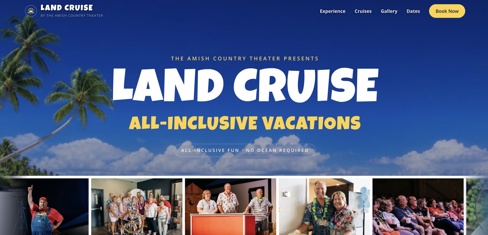
Land Cruise Vacations is built on one image: a cruise ship that never leaves land. Multi-day, all-inclusive trips through Ohio's Amish Country — lodging, live shows, meals, experiences, all packaged like an itinerary of ports. The brand had to carry that wink in every pixel: vacation-brochure warmth crossed with backroads Americana, sunrise over a cornfield instead of a bow wave.
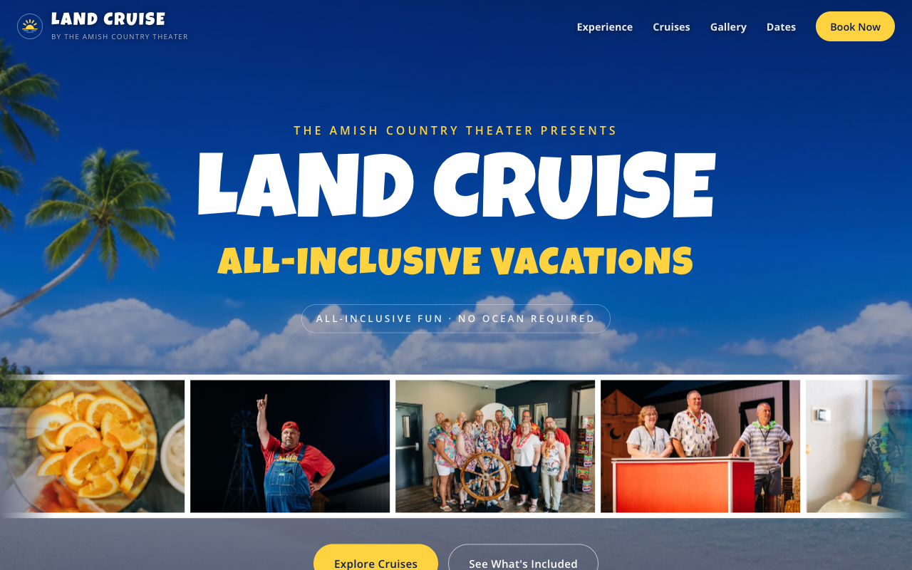
Designing the wink
The identity starts with the logo: a golden sunrise over water-blue waves, stacked over the wordmark. The palette is deep navy, bright gold, and a soft water blue — nautical colors doing landlocked work. Type is the joke told straight: Luckiest Guy, a big friendly display face, for headlines; Open Sans for everything that needs to be simply read. The tagline sets the tone for all the copy: All-Inclusive Fun. No Ocean Required.
I drew a custom SVG icon set for the site — sunrise, barn, ticket, utensils, dice, bed, waves, ice cream cone — instead of pulling a generic icon font. It's a small thing that does a lot of work: every icon is on-brand, recolorable in CSS, and embedded right in the page with zero extra requests.
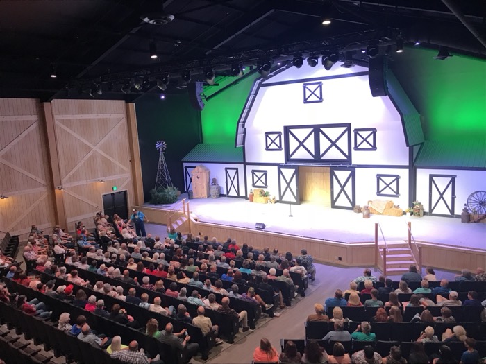
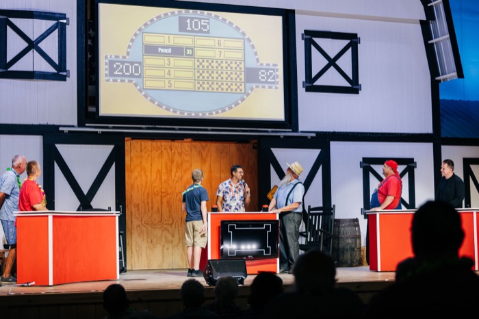
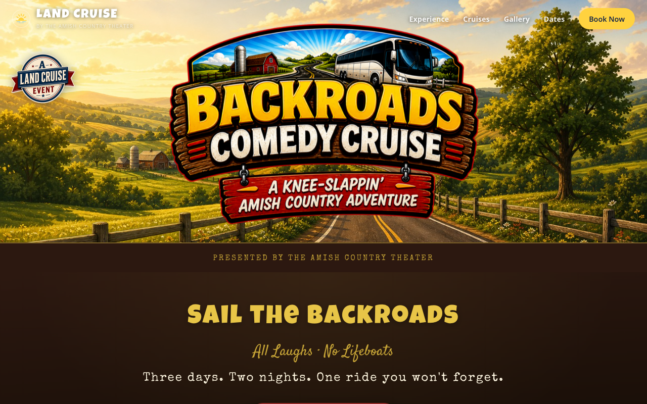
The parent brand holds a growing family of trips — the Original Land Cruise, Gal's Getaway, a Christmas tour, a Rhonda Vincent music cruise, and the Backroads Comedy Cruise. Each gets its own landing page with its own personality, inside the same design system. And the photography on the site is the real thing, not stock: these are our guests, filling the theater and playing the game shows.
No framework. On purpose.
Here's the part that surprises people: landcruisevacations.com is hand-written HTML, CSS, and vanilla JavaScript. No framework, no build step, no node_modules. The repo is the website.
That was a deliberate engineering decision, not nostalgia. A marketing site has exactly two jobs: load instantly and hand the visitor to checkout. Everything I'd normally reach for a framework to solve — routing, state, data fetching — this site doesn't have. What it does have:
- Aggressively optimized images. Every photo ships as WebP and JPG at multiple sizes (1600px heroes down to 600px tiles), so phones never download desktop pixels.
- Immutable caching. Images, CSS, and JS are served with one-year cache headers via the hosting config; repeat visitors load the site from their own disk.
- A CSS-only photo carousel. The hero's scrolling photo strip loops seamlessly by duplicating frames with aria-hidden copies — an infinite scroll effect with no JavaScript carousel library, no jank.
- Mobile-first layout. The three-column experience tiles, the itinerary timeline, the trio bar (Lodging | Entertainment | Meals & More) all collapse gracefully, because most of this traffic is a couple planning on a phone.
Where the site hands off
Every "Book Your Cruise" button leads into Regy Pro, the registration and checkout platform I built to run the actual bookings — package selection, travelers, payment, confirmation. That separation is the architecture: a static site that can't go down doing the storytelling, and a real application doing the transactions. Each side gets to be excellent at exactly one thing.
The site runs on Vercel and the whole brand — name, logo, copy, icon set, pages — came together in days, with AI agents drafting alongside me while I art-directed. It's the fastest I've ever taken a brand from an idea in a truck to a URL guests are booking on.